Welcome back to the Project Country Club tour! Today we’ll walk you through the main kitchen and breakfast areas—enjoy!
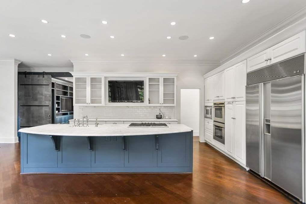
The before: this is the room the clients and I started our design process with and set the tone for the rest of the home. You might notice the same reddish Brazilian Cherry we had in the primary suite, again toned down with ebony stain. The clients were not fans of the large, heavy wall of cabinets to the right and wanted to find an elegant way to break them up and add interest. They also wanted more modern features like a more angular island, a statement range hood, and lots of stone.
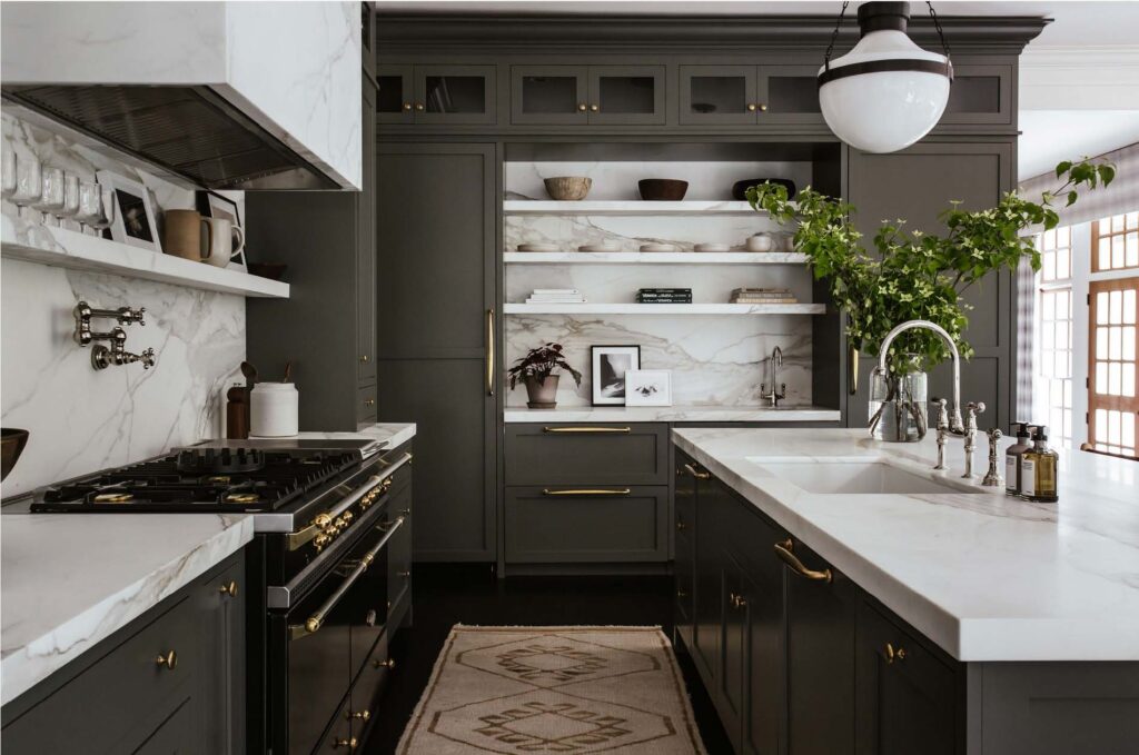
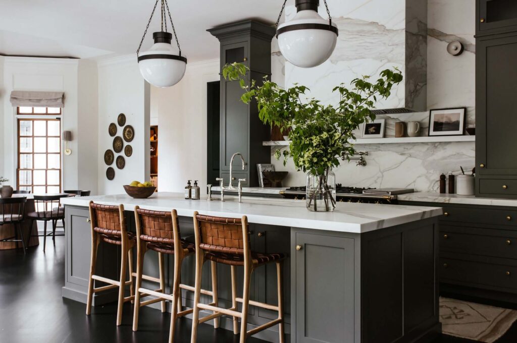
The result: we decided to break up the cabinet wall by separating the refrigerator and freezer into two paneled columns, which we ordered from Miele, and then added stone—Calacatta Borghini marble—to the counter, backsplash range hood, and shelves. Also on the clients’ wishlist were double dishwashers which flank the sink and extra refrigerated drawers between the fridge and freezer columns. We all agreed early on that the home would have a “transitional” feel which led to us here mixing unornamented shaker paneled cabinets with a Lacanche range, traditional Perrin & Rowe Faucets, and crown to match the existing crown in the room, which was to be kept.
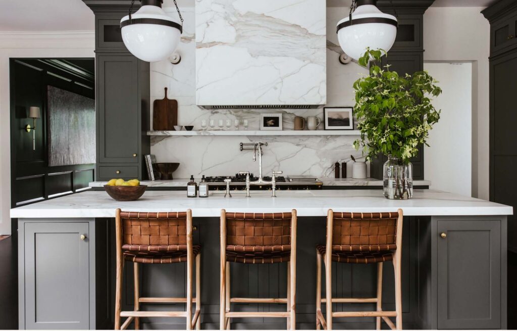
The transitional theme of mixing old and new was at play again in the lighting, with schoolhouse Pendants by Visual Comfort and minimalist Sconces by Apparatus. Leather Stools by Saffron and Poe add warmth to the otherwise cool space.
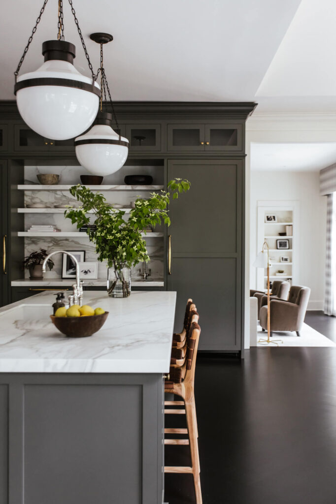
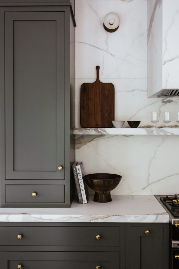
The cabinets, painted Thunderous by Sherwin Williams, are paired with smooth, dark floors to create a striking mood. The marble and walls, painted Mayonnaise by Benjamin
Moore, provides lightness and contrast.
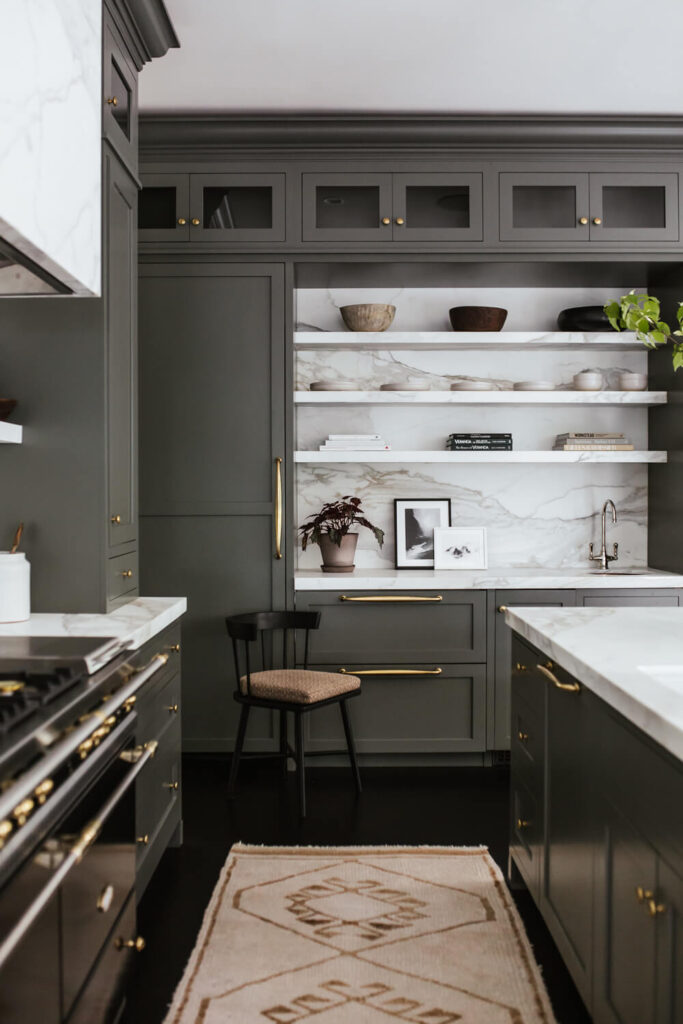
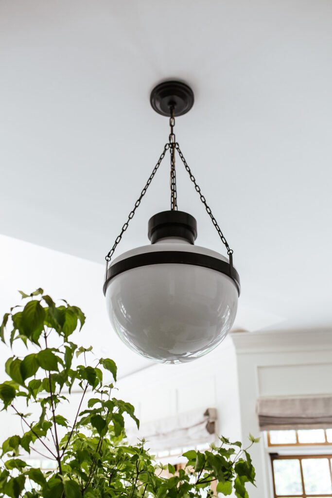
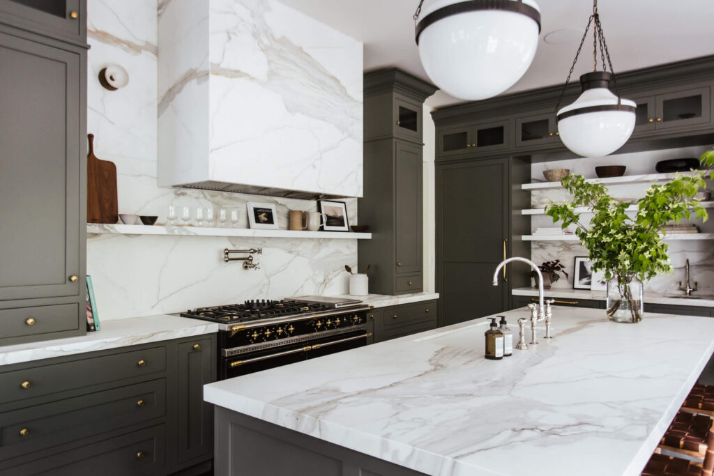
Mixed metal finishes were another theme we suggested for the room, inspired by the mixed metals of the Lacanche range. Darkened brass light fixtures pair with polished nickel faucets, tarnished brass hardware, and a copper bar sink, blending harmoniously.
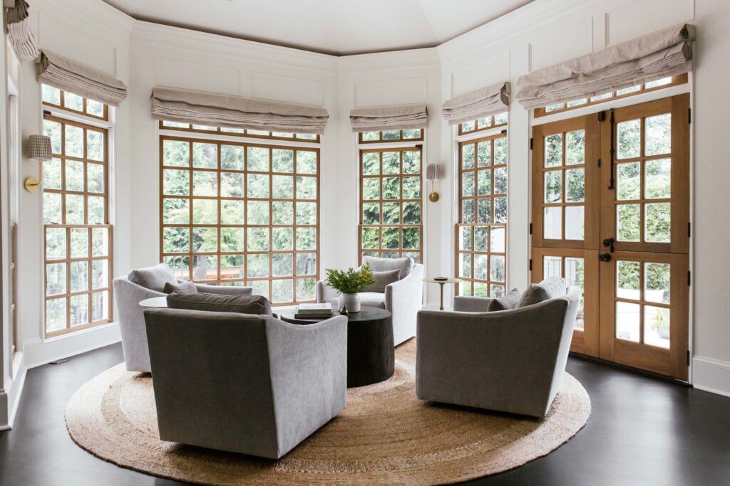
Moving onto the two breakfast areas off the main kitchen: we decided to turn one of the breakfast areas into a small lounge area for gathering to not have superfluous dining spaces, and this was the result.
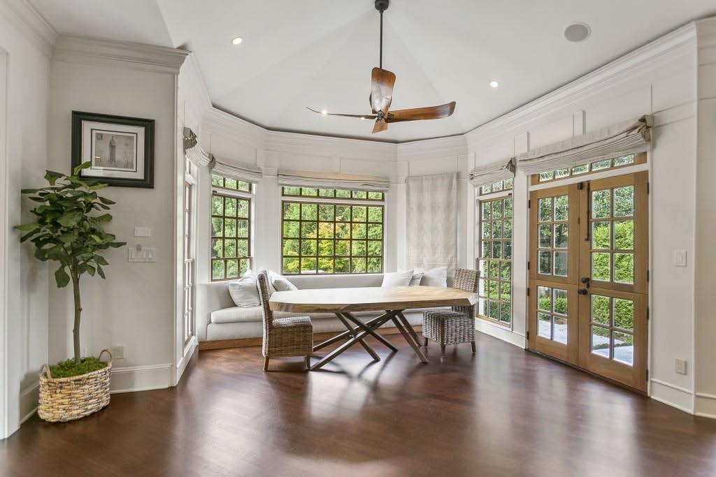
The before: a built-in banquette blocked several windows and the extra dining table the clients did not find necessary. We also wanted to remove any hanging fixtures to let the kitchen pendants shine—we added wall Sconces from Visual Comfort to both seating areas instead for ambient lighting.
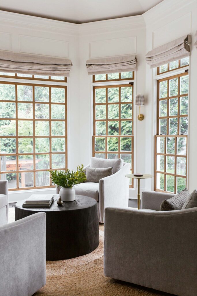
We chose a custom coffee table from David Stein, an Armadillo jute rug, Swivel Chairs by Arhaus, and gilded Side Tables by Jayson Home. We kept the original linen window shades and added custom lampshades to the sconces in a patterned fabric by Harwood House.
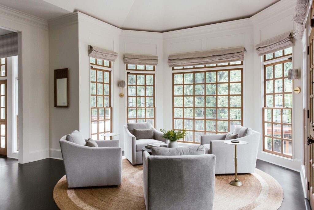
A vintage teak mirror is placed adjacent to the original bay windows. Custom pillows in fabric by Natasha Baradaran add texture.
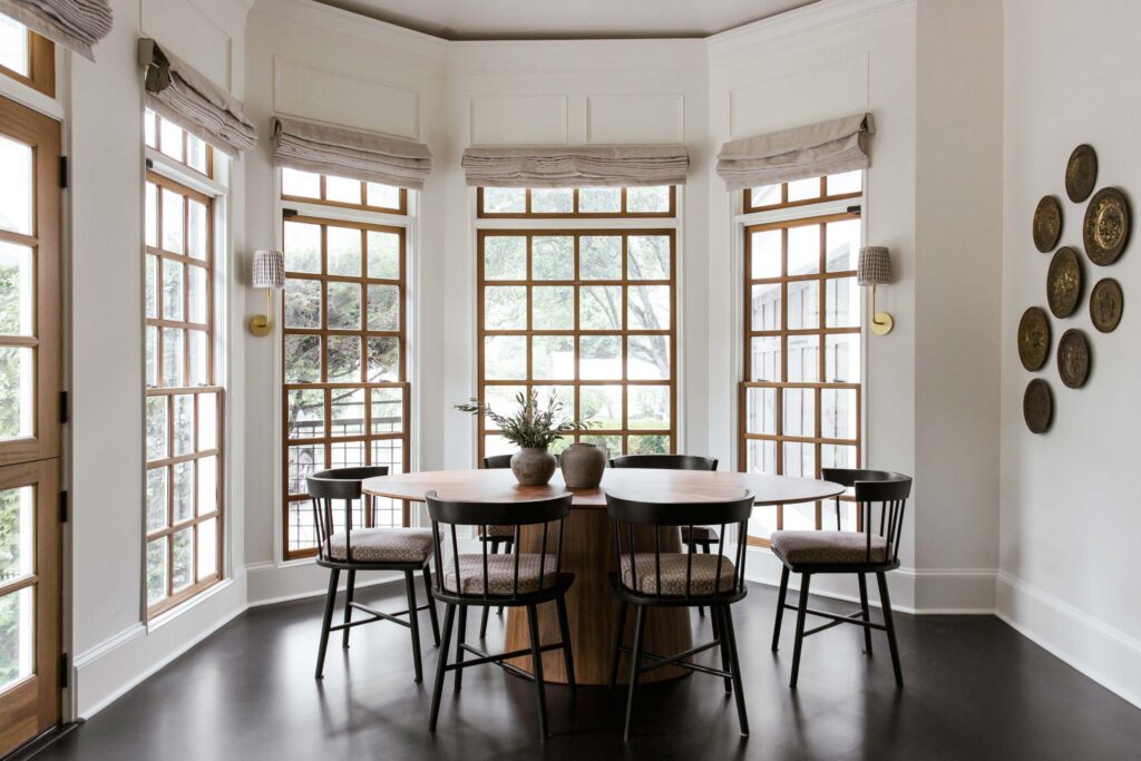
We chose to make this area to the left of the kitchen our dining nook. An elliptical Table by Lulu and Georgia pairs with Chairs from McGee and Co. with custom cushions in brown tweed by Natasha Baradaran.
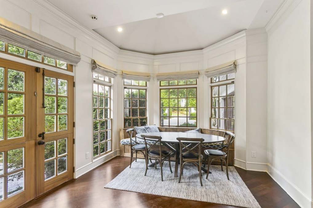
The original space: once again, we removed a custom banquette that blocked several windows and added dimension to the space with new wall sconces and decor.
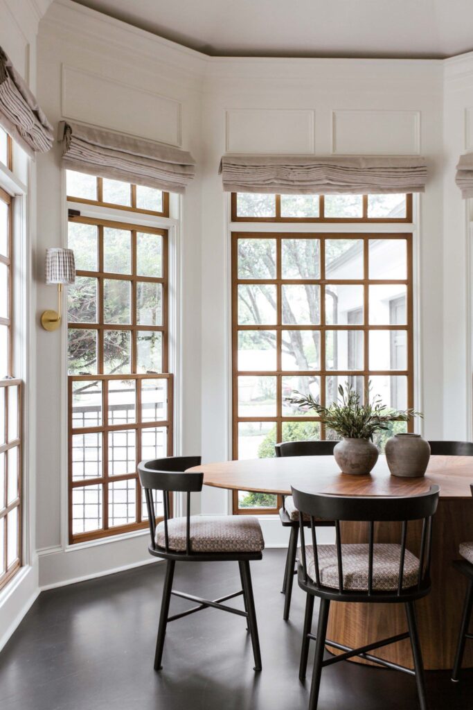
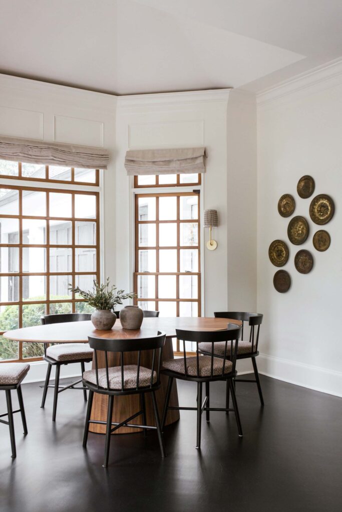
A pair of terra cotta pots and decorative plates, both vintage, balance the cleanness of the new furniture and add texture.
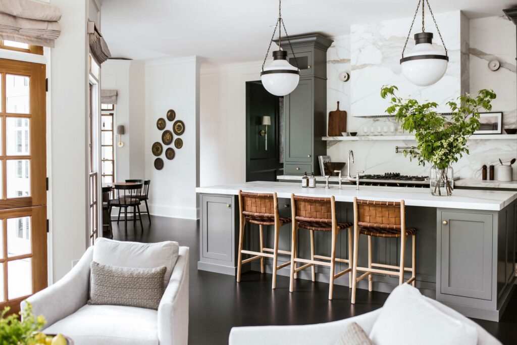
The three spaces in harmony, with a peek at the dining room beyond.
///
Please follow along as we tour the Butler’s Pantry next!
