Welcome to Clairmont, the project that started it all! This is a personal home for us that was purchased in the midst of COVID lockdowns in late 2020. We were drawn to this home by its lush natural surroundings and mid-century vibes of the neighborhood, but what started for us as a simple ‘flip’ soon became a passion project and a gateway into the world of interior design, leading to the founding of Harry Young Design itself, so please come along for this special tour!
The Before
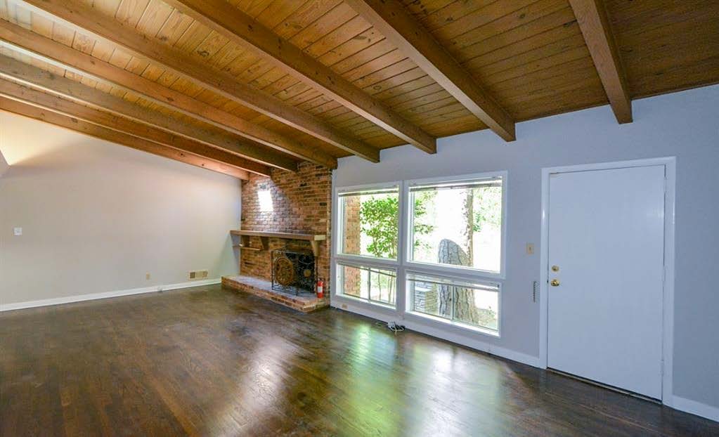
In addition to the nature and neighborhood, we were inspired by the stained wood vaulted ceiling in the living space. We had been seeing a sort of modern farmhouse or cottage-chic style mixed with mid-century elements across social media and thought the ceilings would be a perfect start for a home designed in that style. Homes with that look shared on social media were really our first introduction to the world of interior design.
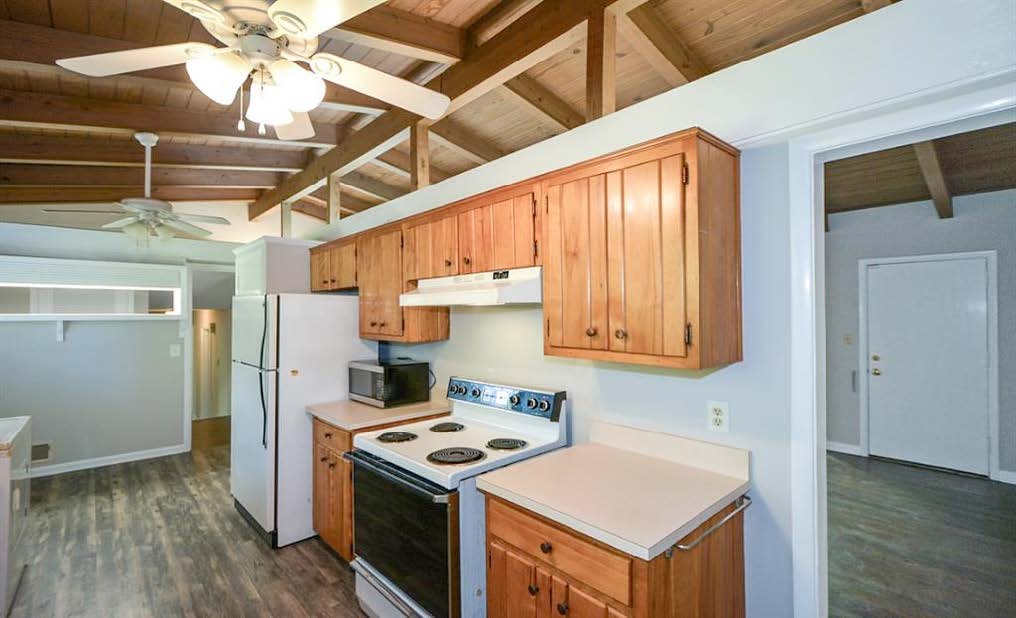
The living area now, which is a combination kitchen, dining, entryway, and living room wasn’t always this way—here is the before. There was originally a large, awkward wall that didn’t quite reach the ceiling, dividing the space in half.
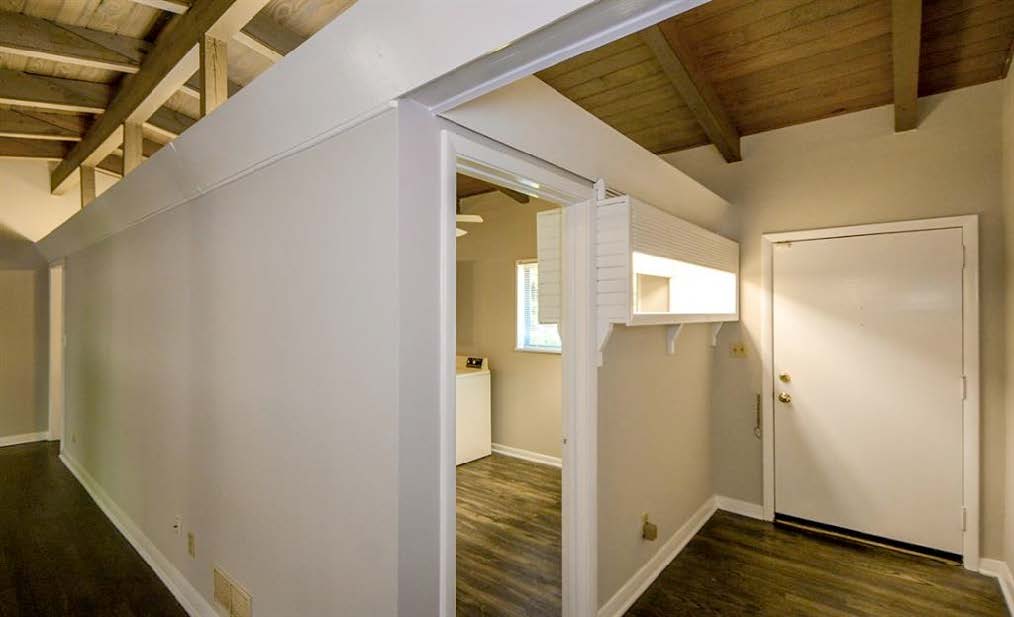
Though we started this project with almost no knowledge of interior design or construction, we immediately knew this floor plan needed a change, so our first move was to open up the floor plan by removing the wall and installing a large beam. Though we are not hugely into wide-open floor plans normally, the living and dining areas were tiny, cramped, and dark and just did not work.
The After
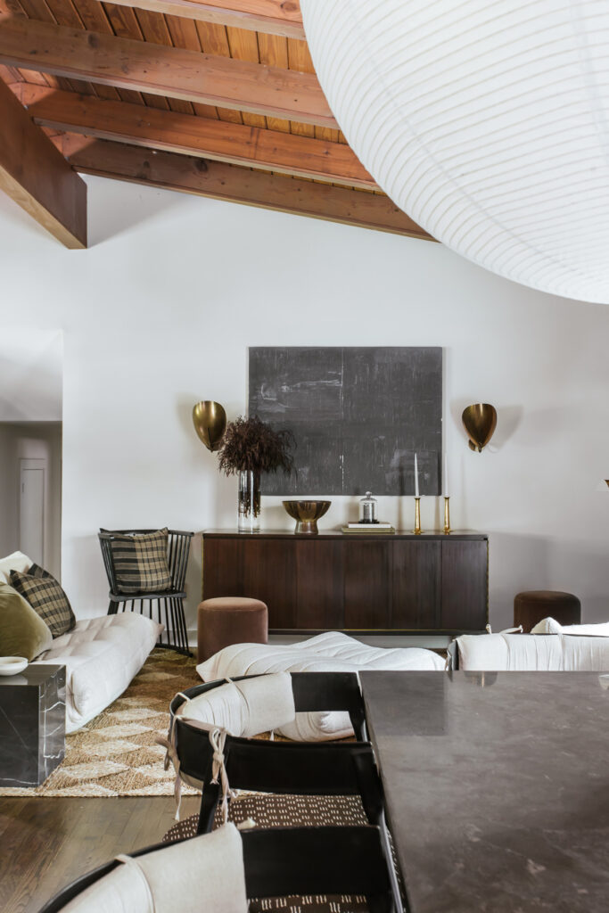
Now, the newly opened dining area features an oversized paper light, Dining Table from Lulu and Georgia, and Chairs from Burke Decor with custom cushions in a Mark Alexander Fabric. We kept the original stain on the ceilings and stained the beam to match. We replaced the four smaller windows behind the dining table with one oversized window and installed a new full-light door to bring in more natural light.
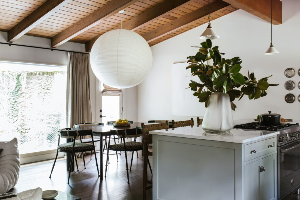
Dueling black and white paintings by Lakshmi Moorhead face off from across the room.
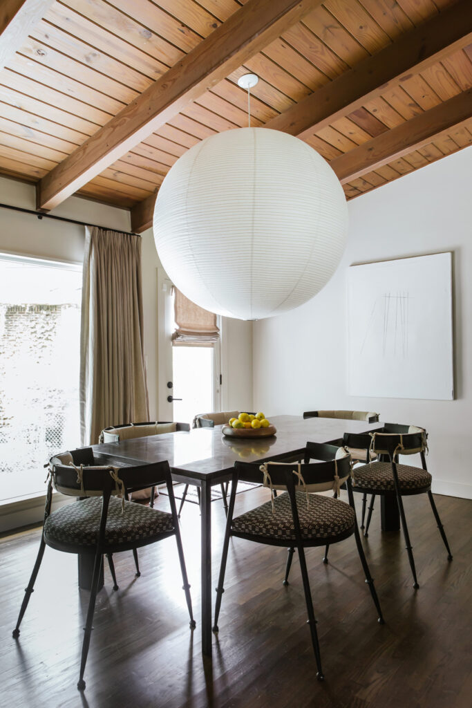
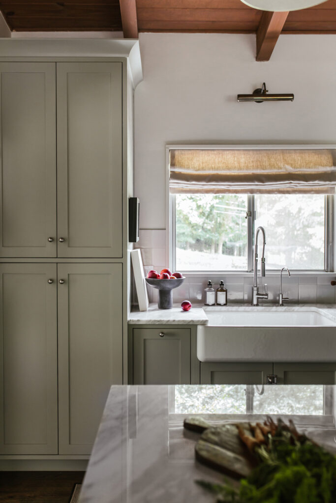
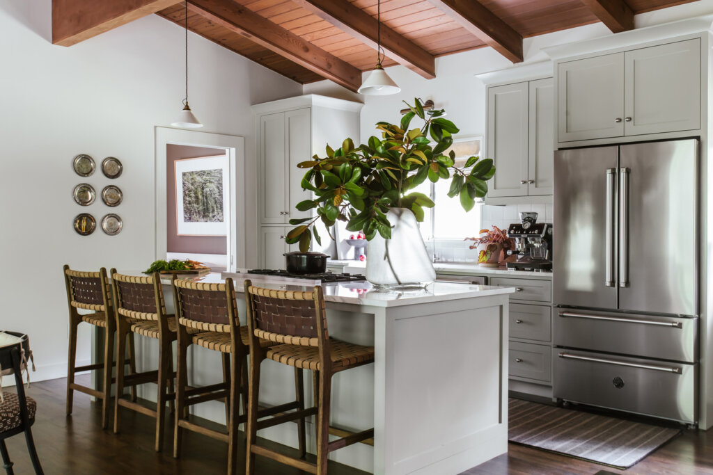
The cottage-chic vibes started with this gray-green for the kitchen, Blue Gray by Farrow and Ball, and crackled ceramic Pendants by DeVol. From there, we chose appliances by Bertazzoni and Stools by Arhaus.
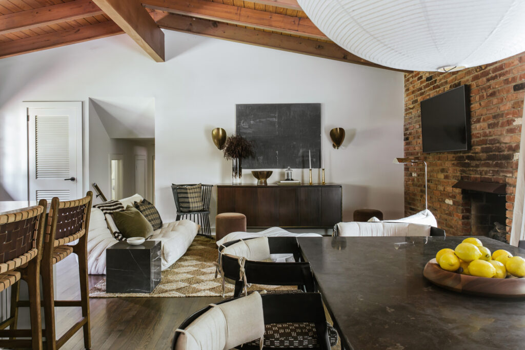
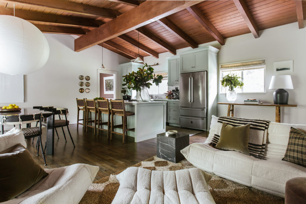
The new view of the open floor plan. We wanted the home’s palette to be based on a very soft off-white greige, so we chose School House White by Farrow and Ball for most of the walls and trim.
The doorway leads to the Primary Suite which which was formerly a utility closet and carport. In the kitchen, silver trophy plates and a mounted Artwork from McGee and Co. sit in subtle tension.
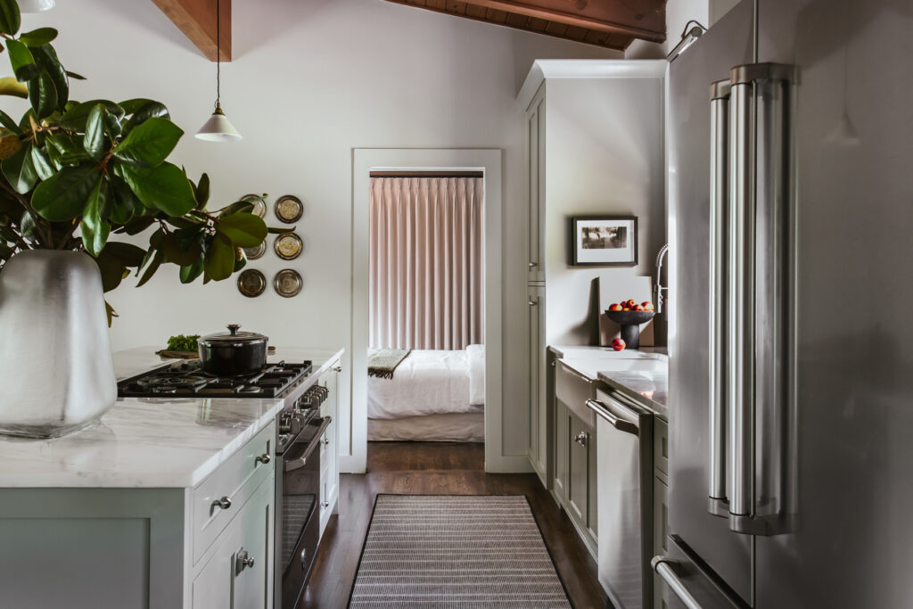
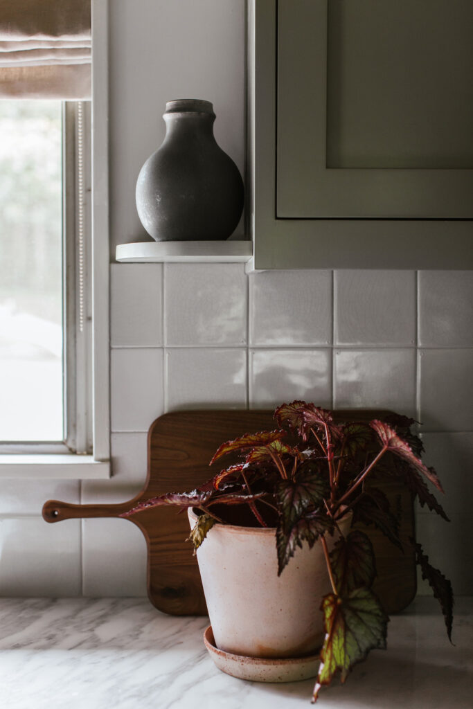
Details such as the crazed Delft backsplash and miniature, curved shelf featuring a pot by Victoria Morris pack this small kitchen with texture and interest.
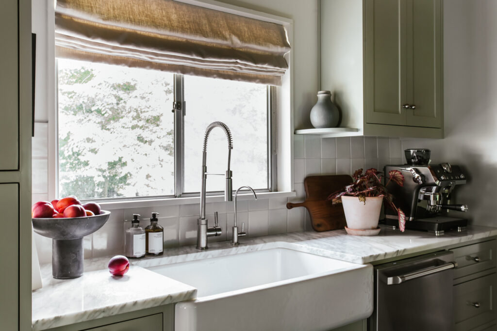
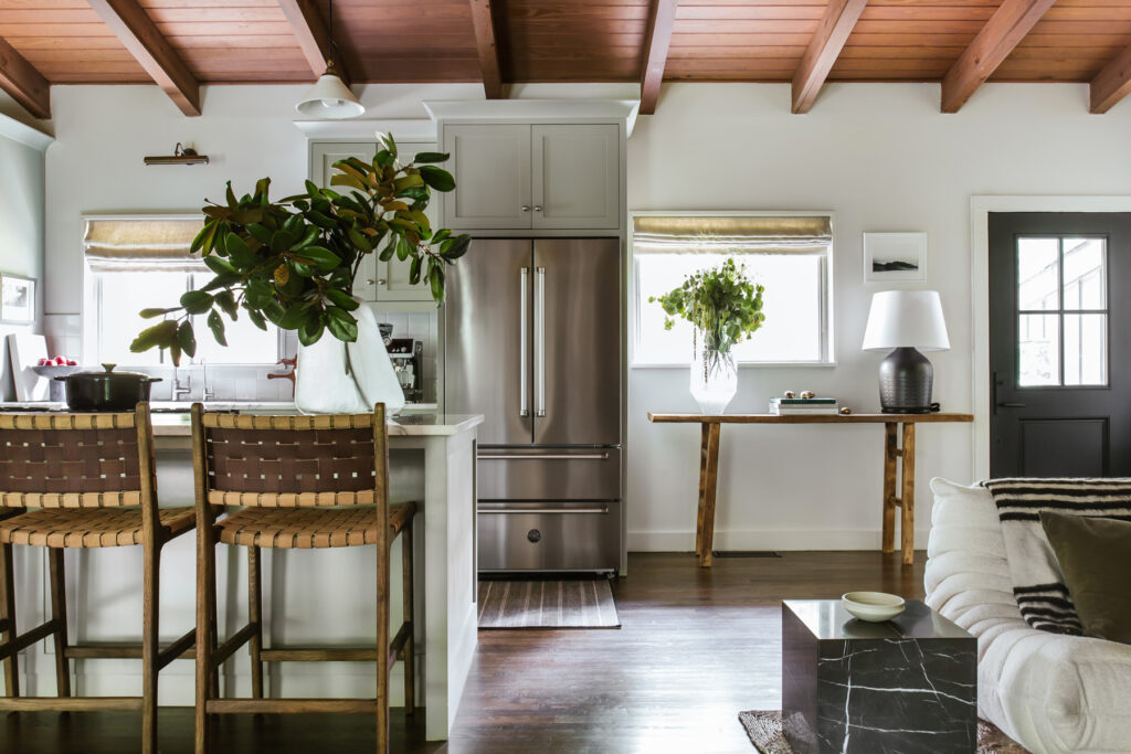
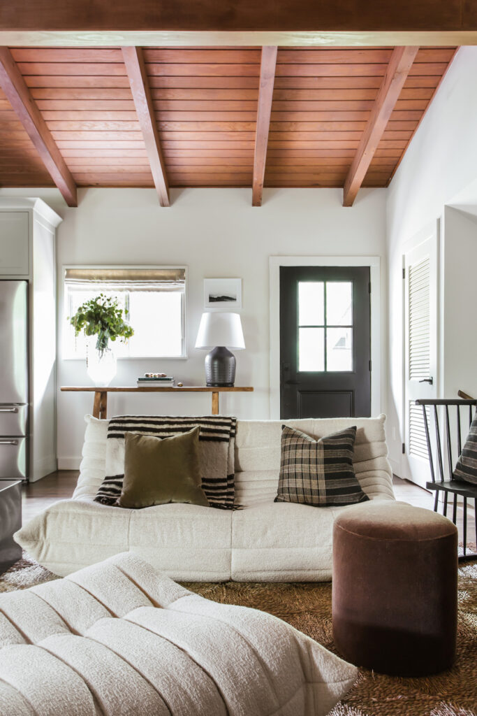
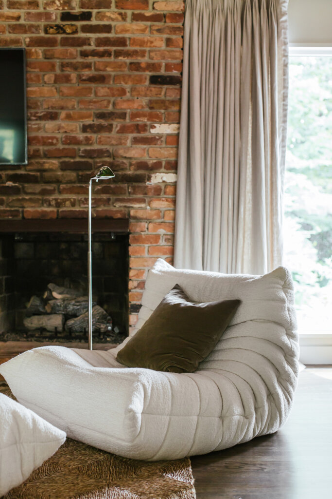
The living area features a set of Togo seating by Ligne Roset in a cream boucle. The front door is new from Pella.
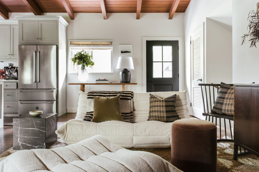
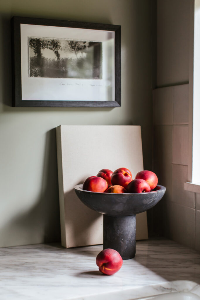
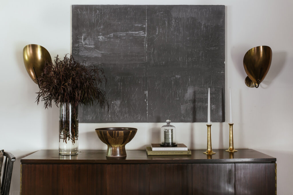
Details: a spindle Chair from Howe London sits beside a vintage mid-century sideboard from a local antique store. In the kitchen, warm countertop accessories balance the cool tones.
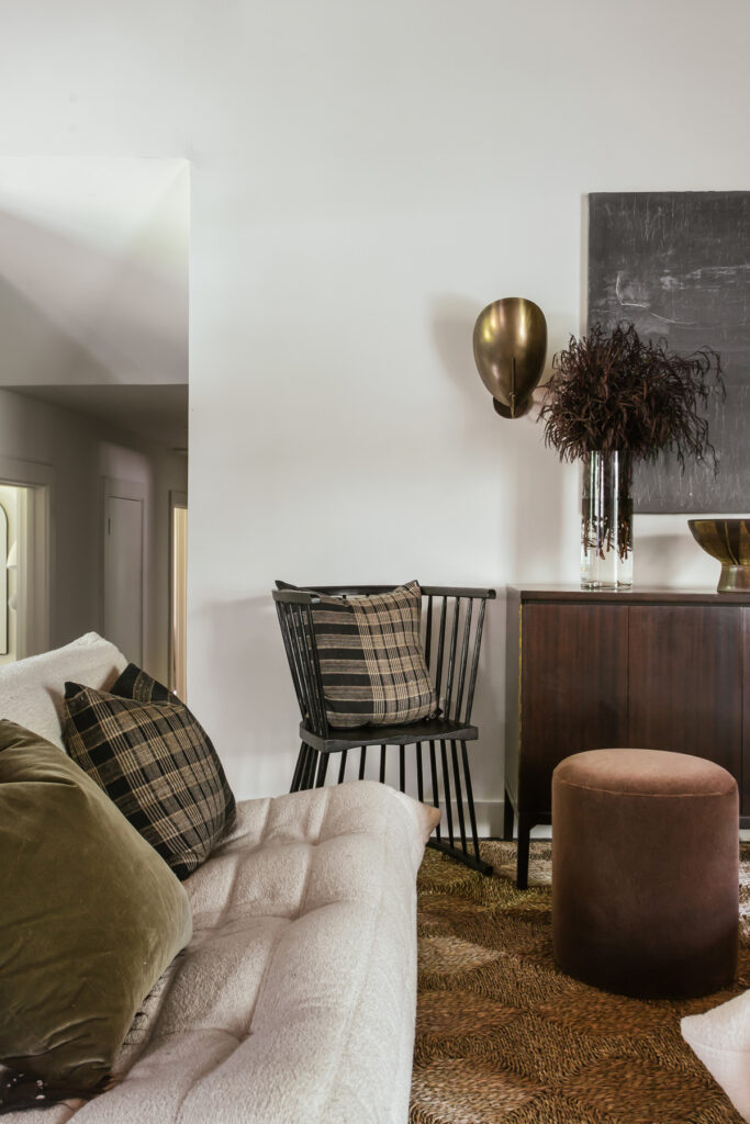
Layers of wood, plaid, boucle, linen, mohair, and jute mix in modern farmhouse splendor.
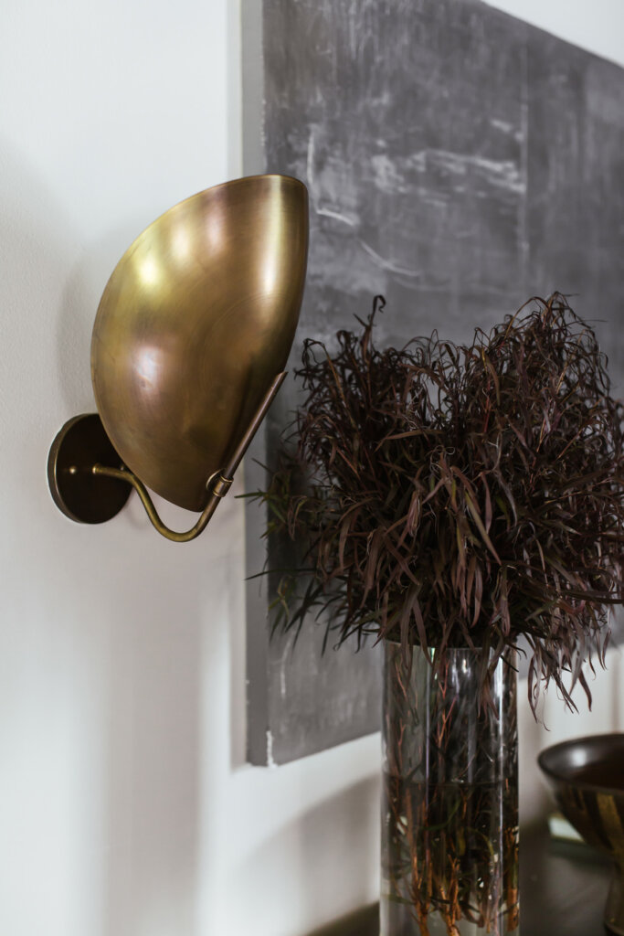
Sconces flank the darker Lakshmi Muirhead piece.
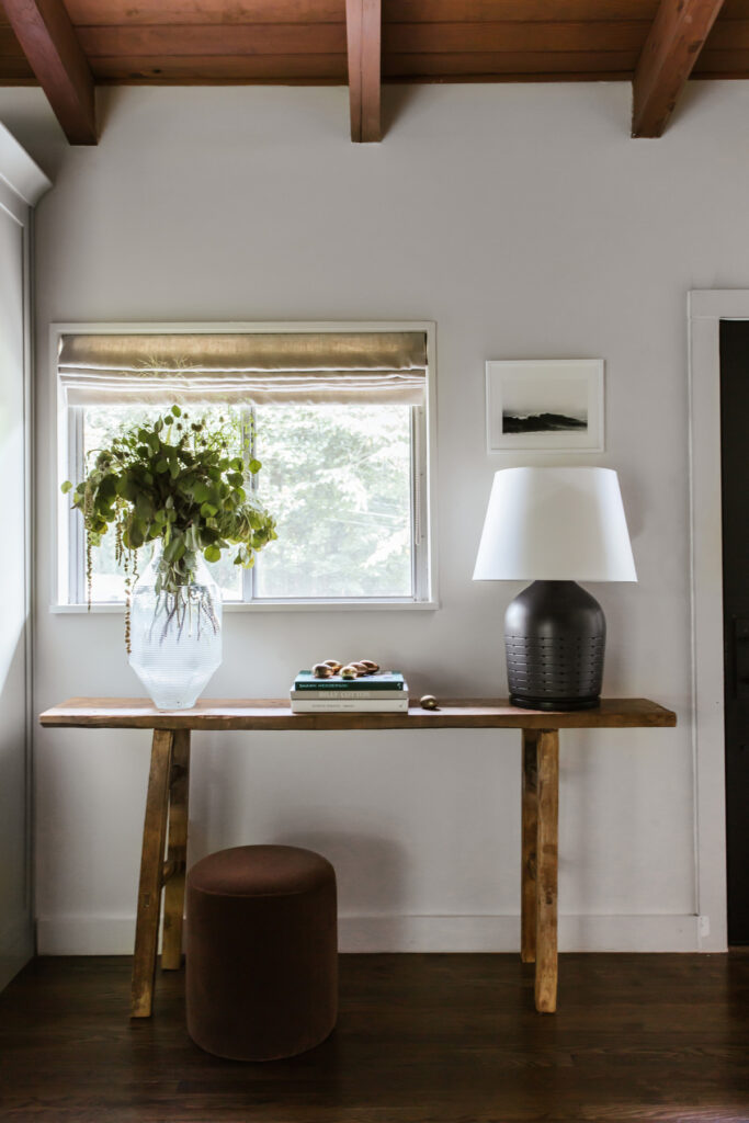
A Rush House Rug grounds the living room with a subtle geometric motif. The original brick fireplace remained as it was. In the entryway, a playful vignette is composed of an antique elm console table, Lamp by Visual Comfort, vase by Vanessa Mitrani, and a set of vintage brass eggs from Den Los Angeles.
Follow along next time as we tour the primary bedroom and office.
