Welcome to the last chapter of our Clairmont tour. Though these are the secondary bedrooms, they may be our favorite rooms in the house, so please follow along and enjoy!
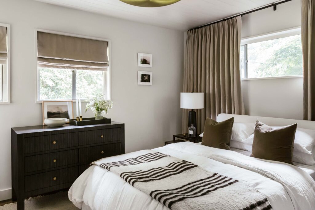
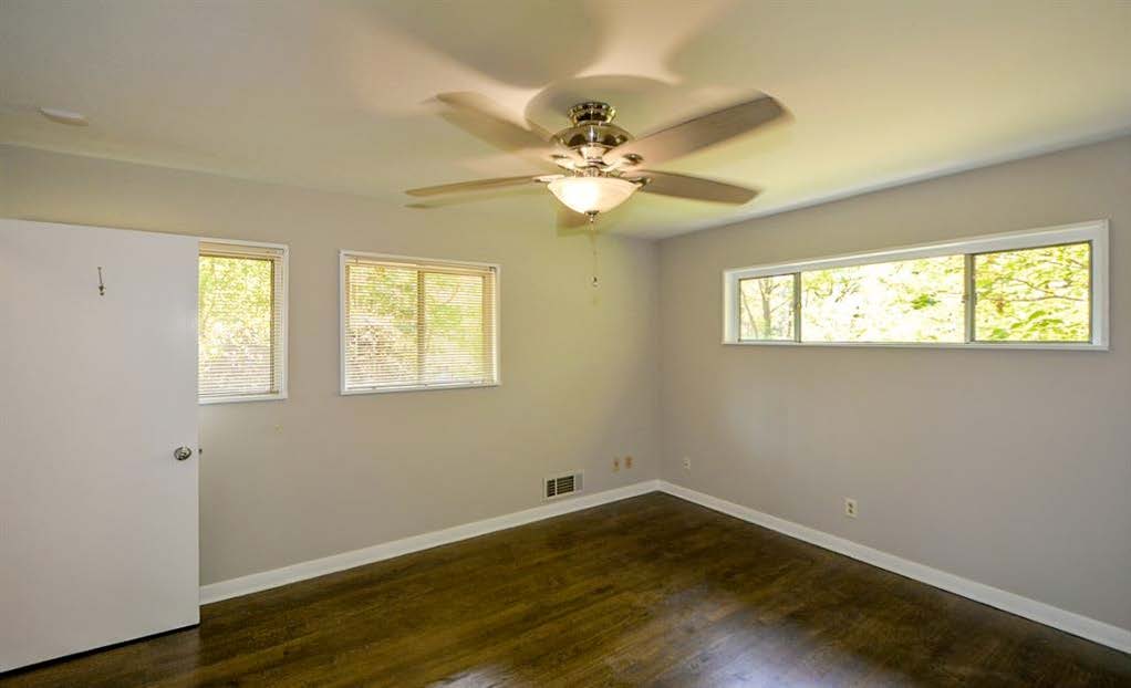
Here is the before of the first bedroom, a fairly standard small bedroom with generic features save for a long, linear window above the bed. We wanted to leave our mark on these rooms with some of our design signatures without overstuffing them, allowing room for the personalities of their future occupants.
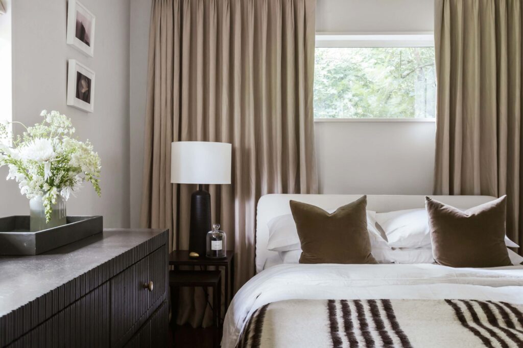
For the first room, we kept it neutral with walls painted in School House White by Farrow and Ball and added signature drama with floor-to-ceiling, wall-to-wall linen curtains. The soothing neutral theme, also a favorite of ours, continued with dark velvet Pillows by Rejuvenation, a striped mohair throw, and dark textured Dresser by Noir.
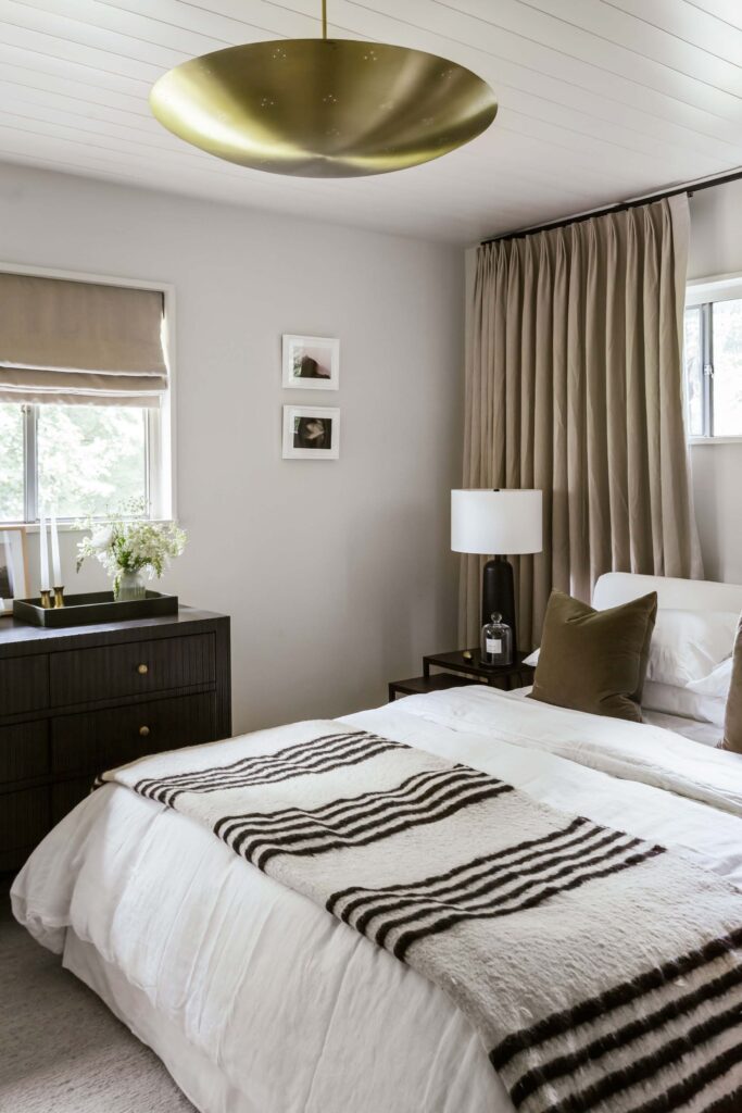
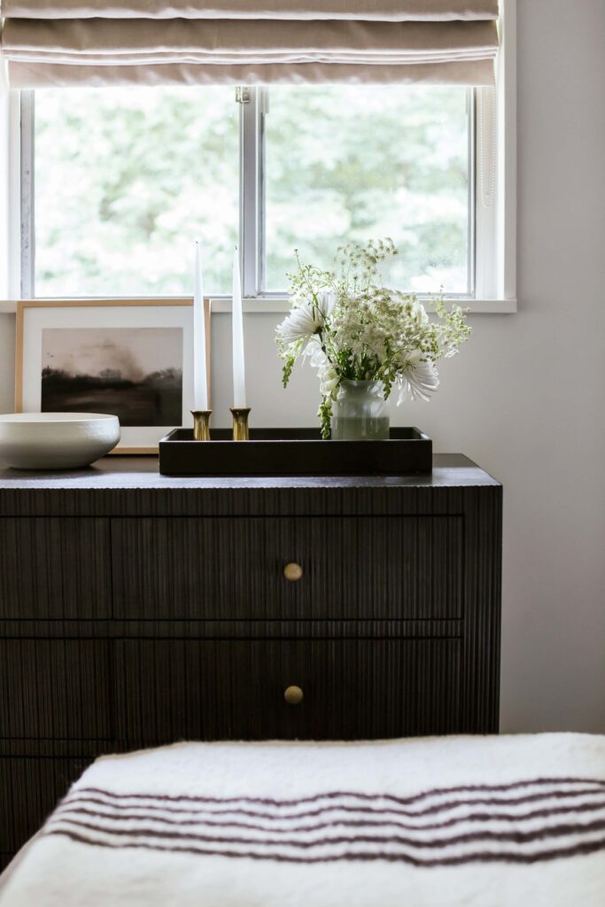
We added texture to the ceiling as well by covering it in shiplap, and a dramatic dome pendant by Lawson-Fenning adds sharpness and glamor, a sort of surprise element we love to include in every space. We also love the use of black to create punchy, high-contrast moments—here, the Noir dresser, ebonized wooden Lamps by Rejuvenation and textured bronze Side Tables from Burke Decor are set off by the bright neutral Rug and Bed from CB2.
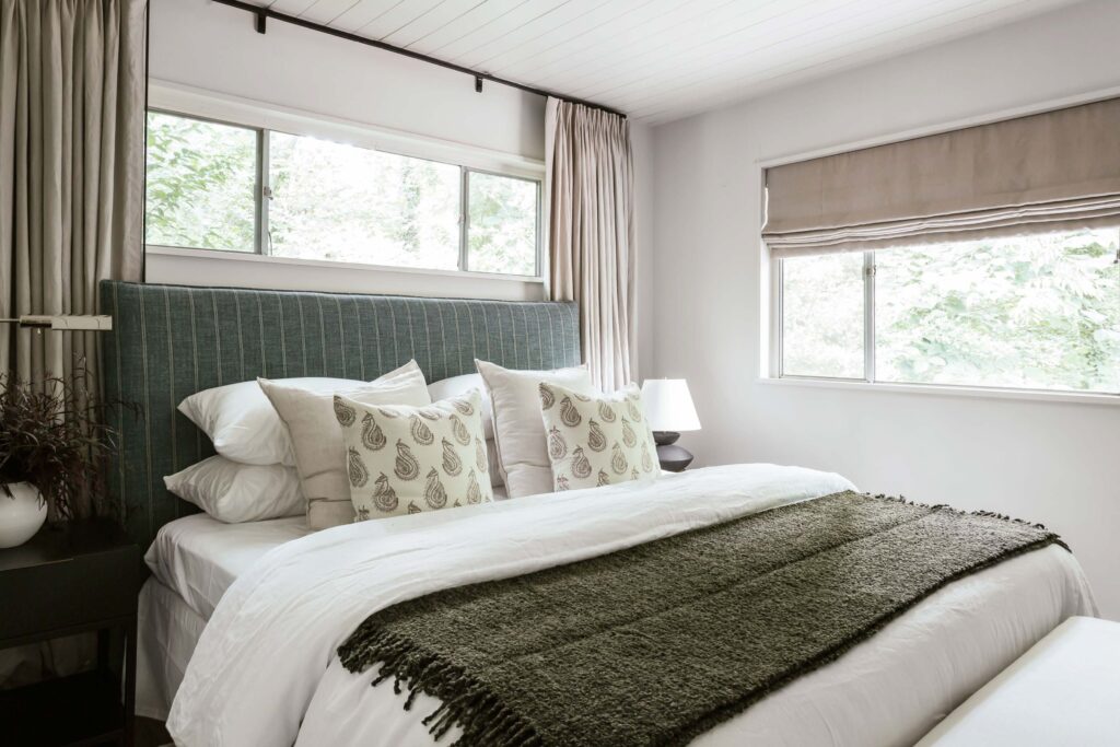
Now for the final bedroom! For simplicity and continuity, we also painted this room, which was basically a smaller mirror of the other bedroom, in School House White, used the same neutral linen curtains and shades and clad the ceiling again in shiplap.
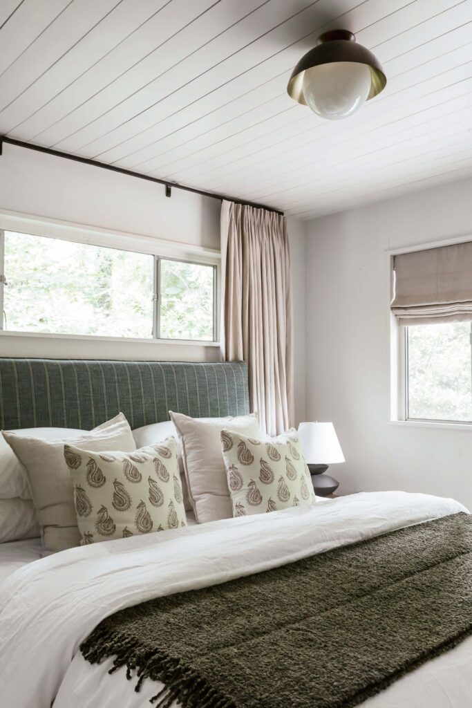
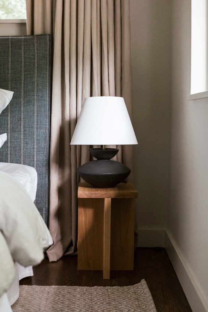
Left: a modern Allied Maker Dome Light in bronze and brass provides surprising contrast to the softly textured bedding and ticking stripe Headboard from Burke Decor. Right: ceramic, wood, linen, brass and wool collide in layers of materiality in this miniature vignette.
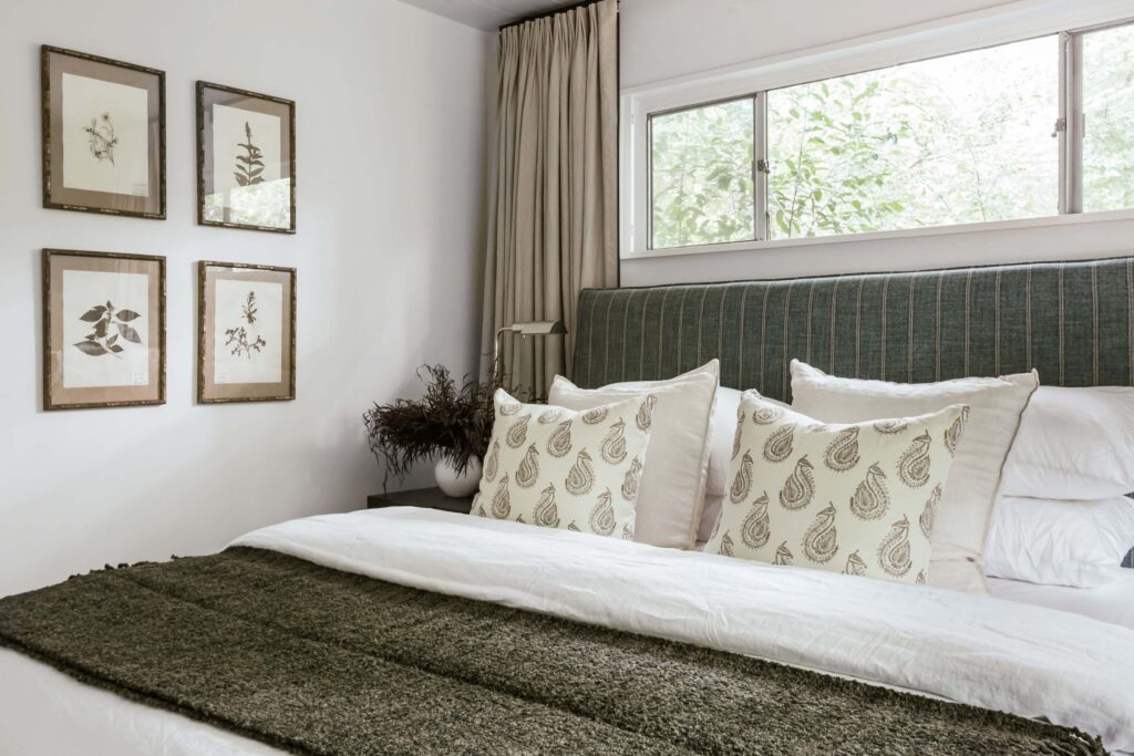
One of our favorite ways to play with asymmetry is in the use of mismatched nightstands and lamps, which we did here with a black Nightstand from Lulu and Georgia and a polished nickel Reading Lamp by Visual Comfort. The vintage pressed plants sourced from 1stDibs bring an organic, lived-in feel to this otherwise brand-new space.
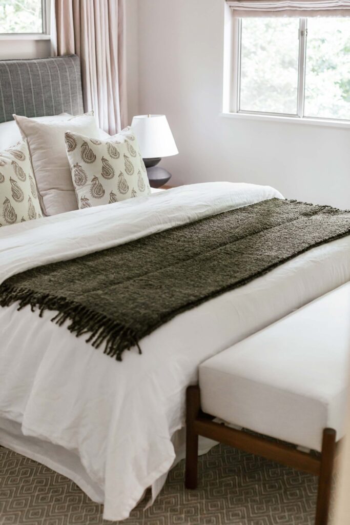
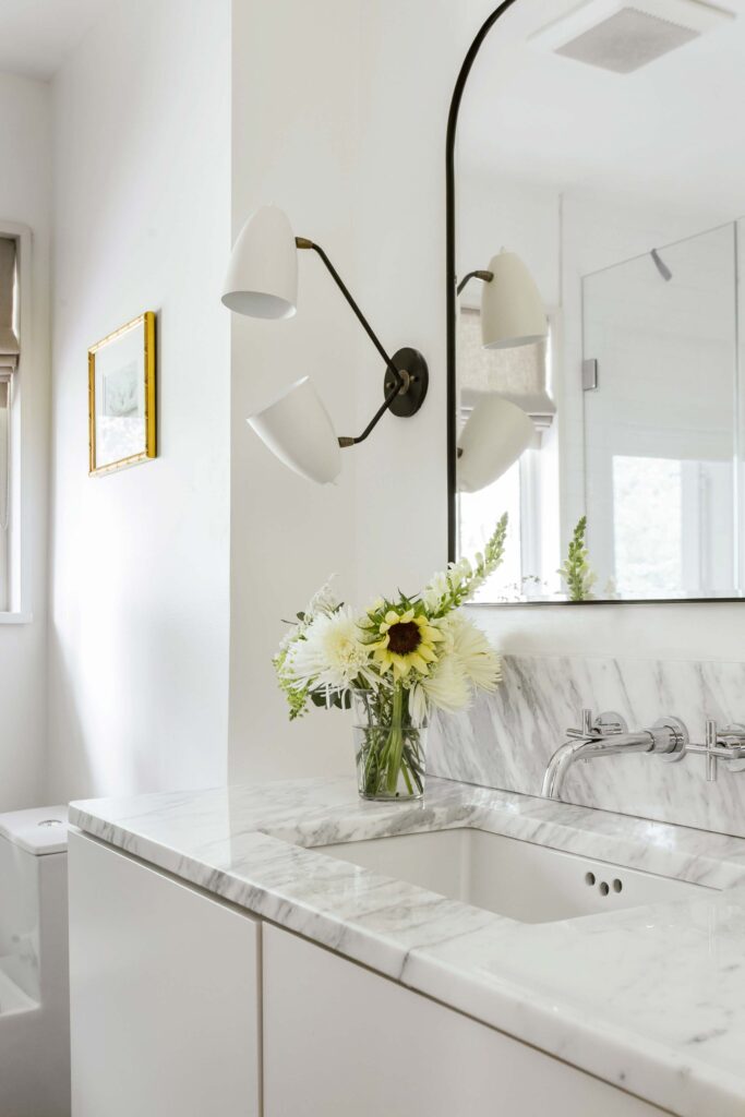
A bench by Alcanena Leather Workshop, sourced from The Citizenry, sits at the foot of the bed, and an Annie Selke geometric rug mingles in pattern play with the headboard and Zak and Fox paisley pillows. To the right: the hall bathroom, designed in a similarly stark style as the primary bath, is painted in Wimborne White by Farrow and Ball and features Gallery L7 sconces and an arched Mirror from Rejuvenation, adding subtle curves to the otherwise spartan space.
///
That’s all for this project, to which we owe so much—and though we have moved on, the lessons learned and design signatures developed here will stay with us in all the exciting projects to come!
Thank you again for following along and stay tuned for more!
